
JOSH + SUSAN FOWLER
Adventure seekers // 15 years of marriage
5 kids // 2 businesses // We like living life to the fullest
explore
welcome to our
home on the web
Weddings
highlight films
Engagements
personal
families
Tips & Tricks // How to Choose Images to Display in your Home
“I LOVE all my images! How am I ever going to choose which ones to display??”
This is something I never get tired of hearing. It’s important that people tell me their thoughts on their photo session, and also when they come across an issues– like choosing the right images to display!
Style & color play a large role in choosing. We’ll start with style:
Style: How do you display pictures in your home? In my living room I have 5 frames that I change out every few months. I have a 16×20, 11×14, two 8×10’s and a 4×6. The 4×6 is tiny but it’s in a large frame. I also have a 16×24 canvas. These images below aren’t the best to show off the frames, but you can see the collage on the left and the canvas & 4×6 on the right.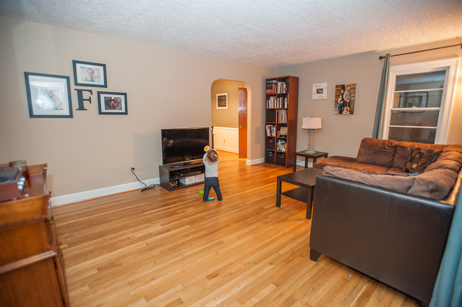 Straight ahead is the 16×20 image, and to the right is the collage pictured above.
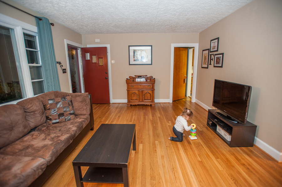 I promise my home has more color in it now! These pictures were the first month after we moved in.
When it comes to canvases, choose wisely. I have one that I love. It’s from our maternity session 2.5 years ago and we look fantastic! It stays in our living room. The other is from my daughters 6 month session. It’s cute & all, but she’s grown a lot since then & it’s kind of outdated now but I’m stuck with it. We keep it on the wall in her room for now, but eventually it’ll get the boot. Go with something timeless for a canvas!
For the frames in our living room, I arranged them so that I can switch them from vertical to horizontal without messing up the look of the wall. I love being able to switch them out whenever I like! Currently I have a family picture, a couples picture, a daddy-daughter picture & two from her newborn session. Yes, she’s two, but they’re breathtaking & I just can’t take them down!
So figure out your style. Do you want an elaborate collage? Something timeless? One large picture? If you don’t already have them, I suggest buying the frames first. You can always take them back if they really don’t work out, but it makes this process a little simpler.
Color: What color are your walls? Furniture? Accents? Are any of those colors in your images? Which images compliment best?
I suggest staying away from large blocks of bright color. The 16×20 print in my living room has a lot of yellow in the background. I muted the yellow a bit before printing (yes, perk of the trade) so it wasn’t overwhelming hanging on the wall. Now it’s perfect!
In a session from last week I chose to take some pictures with this green background. I love the images, but suggested she not put these specific one too large on the wall. It would just take over the room & be a bit too much (at least for her decorating tastes). An 8×10 or smaller works well if there’s a bold color taking up lots of the image.

Instead, these two images bring a lot of color, but nothing overbearing and would be great for a large print.

 Most of the time, large images are landscape (like above). It doesn’t have to be that way, but that’s usually how it works out for most people. However, I love to include some great vertical images for families as well!
Final Advice: Only you know what you want for your walls, but hopefully considering your style & the coloring in your images can help you avoid some disastrous mistakes & have some images you love to look at covering your walls!